Recent stats show that more than 50% of traffic comes from mobile devices. Let’s write it again: people use mobile devices more than their laptop or desktop to view your website.
It’s, therefore, crucial to have your website fully responsive and optimized for mobile devices. The website has to load fast and be user friendly. All fonts and spaces need to be optimal.
We built Citadela with mobile-first in mind. We designed it from mobile to desktop, not the other way around, as many designers do.
Citadela Blocks plugin includes two handy blocks that allow you to play with typography and spacing.
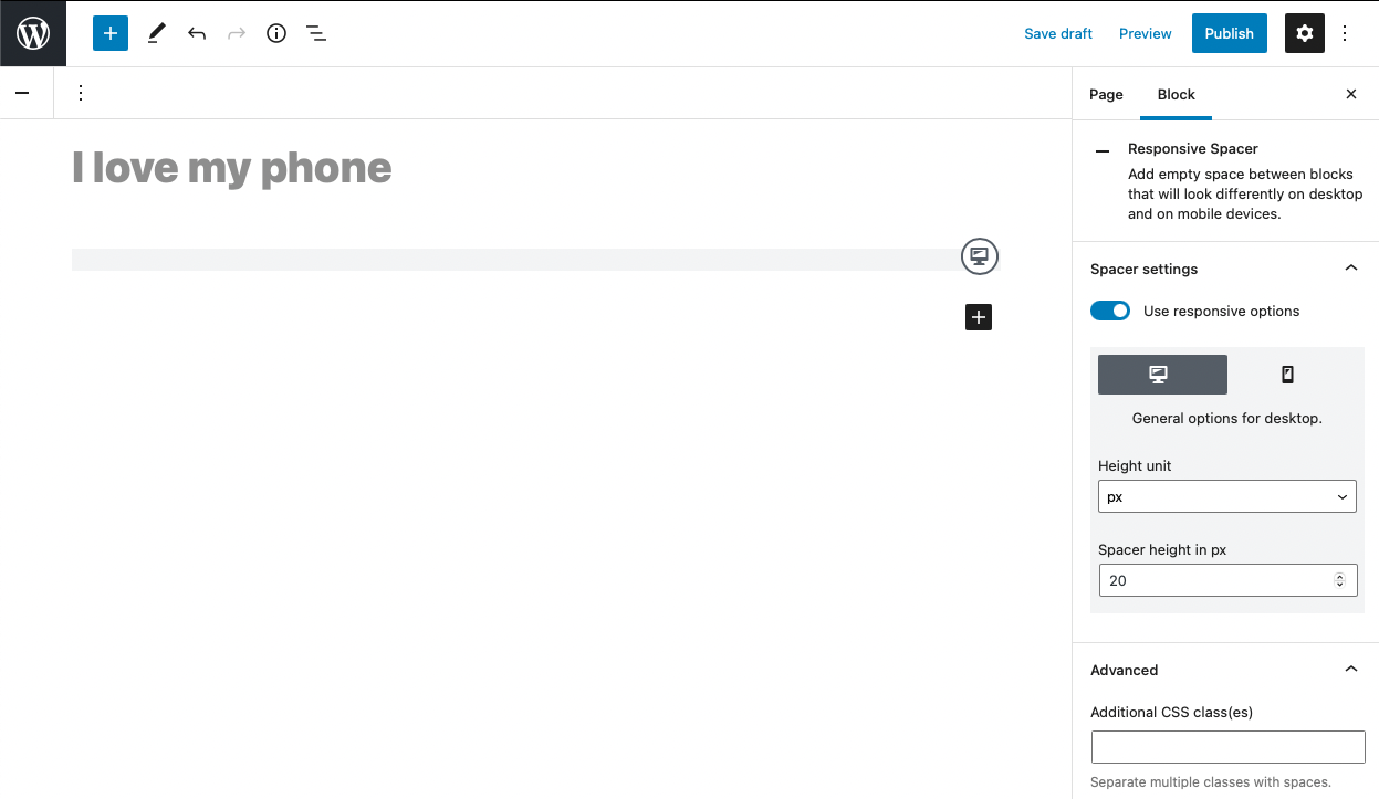
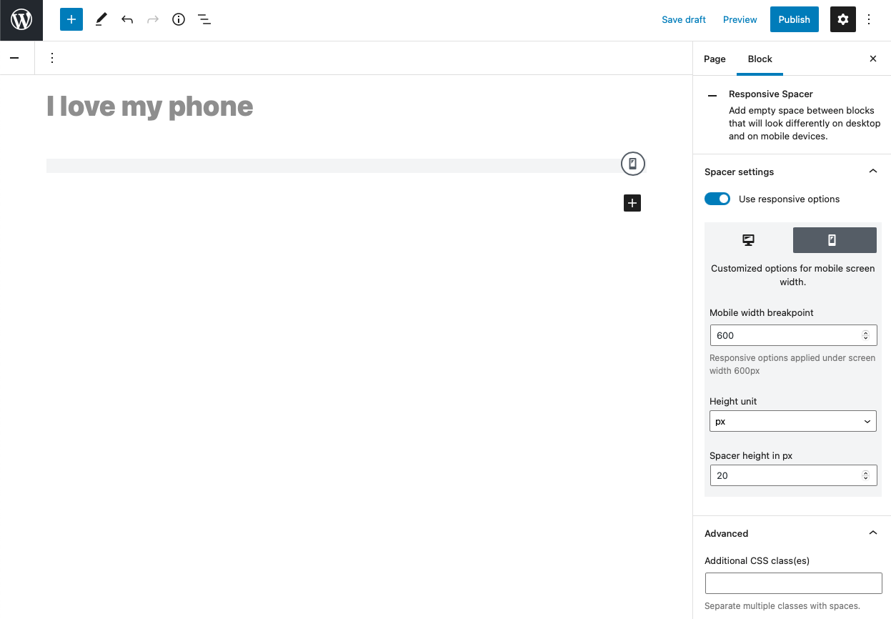
Responsive Spacer
The purpose of the Responsive Spacer block is to manage space between other blocks. Block has many custom settings such as height in units like px, vw, rem, em or %. This block can be configured differently or hidden based on screen resolution.
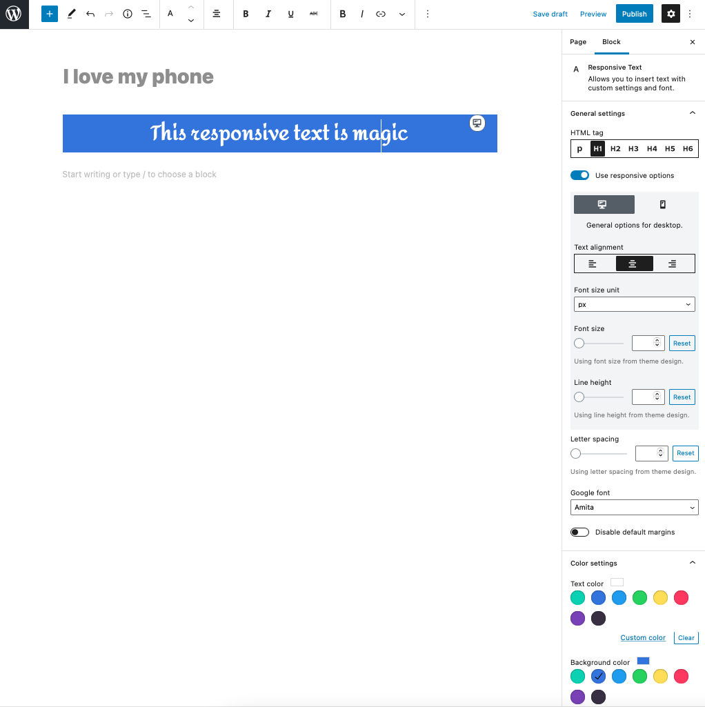
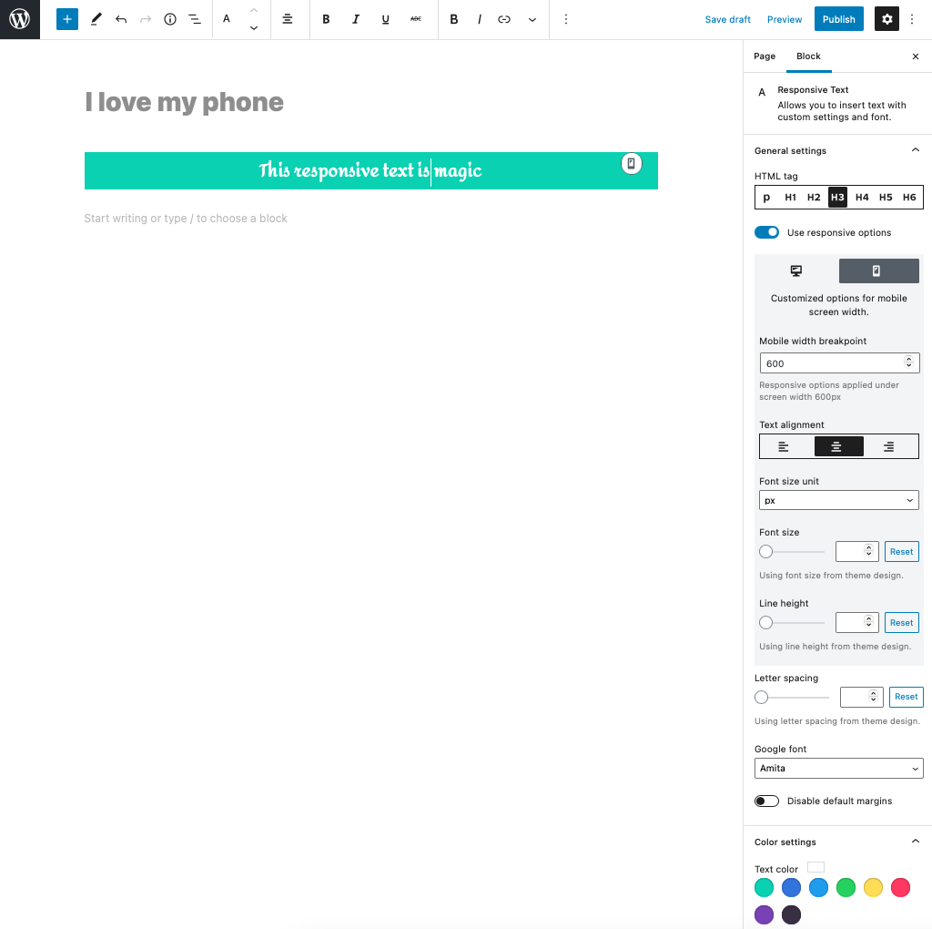
Responsive Text
The Responsive Text allows you to work with typography on your website. You can fully configure one section of the text, set its font, size and spacing. What more, you can put these settings differently for desktop and mobile devices. Responsive Text is a very powerful tool for all designers. You can create impressive presentations for desktop and laptop users that will also look nice on mobile.