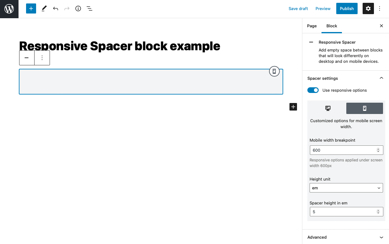
Responsive Spacer block adds empty space to your website, which you can define in different units. It allows you to show the spacer also on the smaller screens where the height of the bar isn’t the same fixed number of pixels on large desktops and small mobile screens.
You can select from units:
- px – fixed height in pixels
- vh – relative to 1% of the height of the viewport (2vh means 2% of the screen height)
- vw – relative to 1% of the width of the viewport (2vw means 2% of the screen width)
- rem – relative to font-size of the root element (2rem means 2 times the size of the root font size)
- em – relative to the font-size of the element (2em means 2 times the size of the current font size)
- % – relative to the parent element (2% means 2% of the parent element height)
Negative values are possible too. That way can content below spacer overflow over the content above spacer.
In responsive design, can be spacer completely turned off with toggle Hide in responsive. The spacer will be disabled on screens smaller than 600px.