
Table of Contents
Choosing the right color palette for your WordPress Photography theme may be a huge step towards the success of your brand. With some catchy motives, your online projects will get way more recognition. Sight is the most important of senses when it comes to evaluating the newly visited website.
You have to make sure that your guests are going to stay and, what’s more important, remember your work!
If you feel like your brand is not getting enough attention, you may need to re-brand. A breath of freshness will not only change the reception for the better, but it may also give you a boost of a very much needed motivation that was reduced when people weren’t visiting. And once you try this, remember to start from colors!
Here are Color Inspiration Secrets
The Choice of Photos
Always choose those photos that you find inspiring. If you feel like the image you’ve just found is all that your blog or page is about, don’t hesitate to use it! It should complement the motif of your website, so pay particular attention to colors, but also to the content and the feeling that it arouses. Use the photos to express your emotions and enhance the message.
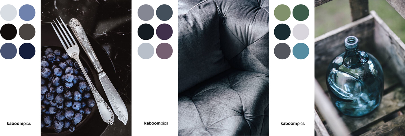
Use The Color Palettes
Some photo stocks offer this feature. Use it! Here, for example, you will find an automatically created color palette with the six main colors from the picture! Every color has a code that you can copy. What’s more, you can download the graphic with the photo and the whole color palette put together. Everything from this website is available for free.
Keep to Your Standards
Once you decided on the coloristic theme of your website, keep to it. It has to be clear to everyone that this is your brand, no matter when it appears, be it Facebook, Twitter, Instagram, Pinterest, Reddit, or even a simple leaflet. Be firm about it so that every time someone sees a set of colors that you use, it will remind them of your brand.
Do you know what people and bulls have in common? Their attention is being drawn to color red.
Check the statistics and find out what are the most popular colors, or just trust your sense and choose them by yourself! If I were to recommend something, I’d say that bright and warm colors should dominate at least 2 to 1. And don’t try to make it too overwhelming! Less is more.
Plan Before You Act
When you are designing a post/ad/article or anything else try to first imagine it in details. Don’t forget about the main theme – visualize it and describe this to someone or write it down. With the clear image in your head, it will be much easier to choose the right colors for your project.
If for example, your target are kids, you should choose warm and gentle colors. If it’s about a healthy lifestyle of working out, you will add more green and blue to it. Always take the target group into consideration, as well as the mood that you want to present.
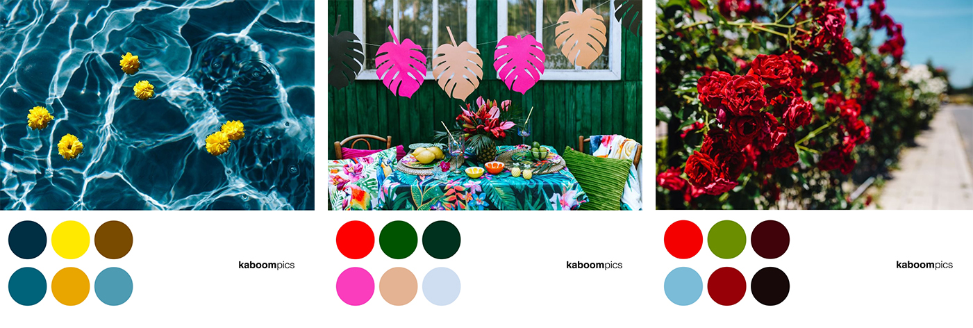
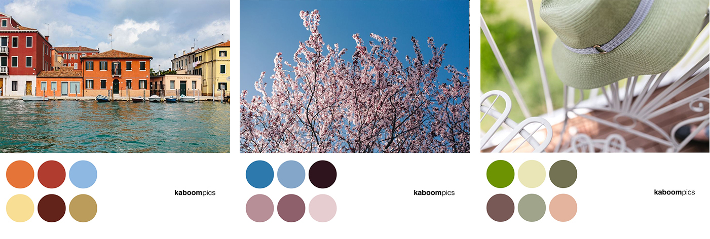
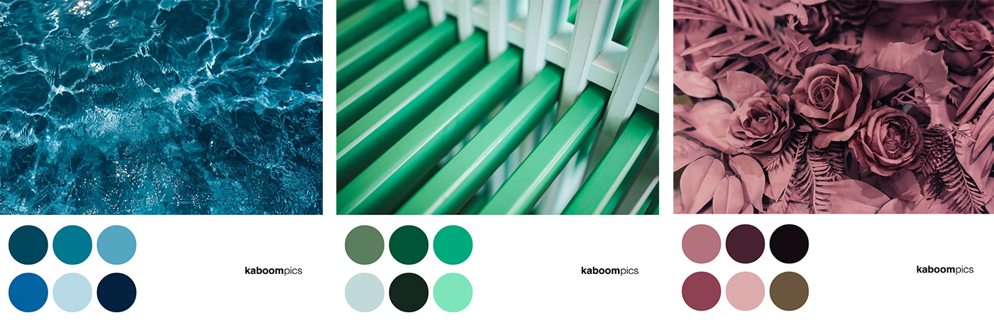
Take a look at the photos below and try to determine how the colors presented on them would help you with your projects:
- The cool, neutral colors may be a great asset to almost any design. The receiver feels comfortable, without being overwhelmed
- More exotic, robust colors would make a great background to everything that’s supposed to evoke emotions in the recipients
- Palettes in pastel tones will add a touch of subtleness to your website. What’s more, they look great in contrast with other design elements. Their primary purpose is to create a relaxing and calming atmosphere that will put anyone in a good mood.
- Monochromatic colors are the safest solution. You don’t have to worry whether they match each other. They don’t draw attention away from the content and create a harmony in your project.
You don’t need much to make your brand shine throughout the internet. Just believe in yourself, focus on your goal, and always plan beforehand.
This guest post was written by Tomek Celler, content creator, idea generator, and marketing alligator for Kaboompics – The Free Stock Photography Website visited by thousands of users every week. Best Photos on the web. Find us on Facebook and Instagram.
Thanks for sharing this post, a Perfect match for my requirement, we hope you send the more helpful article for us.
HI there,
thanks for your comment. The more articles are coming soon… Should you be interesting you can provide us of some topics.
Have a great day!
Zlatko
Thanks for this beautiful post ! :}